Stop losing your customers because of your website’s low performance. There are various devices that customers use to access your website. If they find an inconsistent experience they immediately leave.
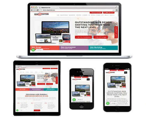
At Webmization, we provide responsive web design services which ensure that your website attracts and engages your customers across all platforms.
According to statistics, more than 50% users accessed the internet using mobiles, 45% used desktops and around 4% used different tablets. 90% of web users use multiple screens to accomplish a task over time. The average person uses 3 different screens every day. On April 21, 2015 Google started taking mobile-friendliness into account as a ranking signal in search. Google changed its algorithm to favor mobile-friendly websites in its mobile search rankings. This huge shift was called Mobilegeddon. This means websites that are not mobile-friendly see a severe negative impact on their search ranking and organic traffic, but sites that are mobile-friendly see a boost! Having a website with flexible design is not a convenience anymore, it’s a necessity. You cannot grow unless you have a responsive mobile design for your website.
As the premier responsive website development company in USA, we are the experts at creating a consistent, yet personalized experience for your customers across every device imaginable. With special HTML and CSS codes, we make your website automatically recognize the viewer’s device and resize itself according to the mobile layout. With a fluid and responsive website, you will stay ahead of the competition – guaranteed!
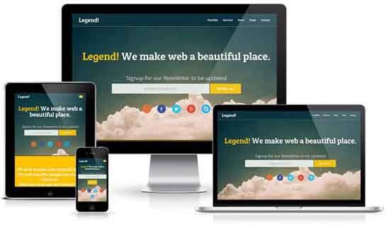
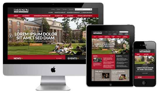
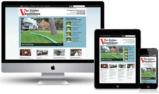
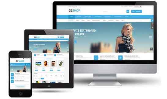
An increasing number of users are now accessing the internet through their mobile and tablet devices which has made responsive design crucial for all businesses. Responsive website design is a way to create a website so that it automatically scales its content and elements to match the screen size of the viewer’s device. It ensures that images aren’t larger than the screen and prevents users on mobile devices from extra swiping and scrolling to read your content.
This is done by using fluid grids that act as scaffolding for your content so that it all comes together nicely. Also scalability is applied to all the images so that they conform to the viewer’s screen resolution as well as the content. Images are optimized so that you can deliver the best image size for any and all devices being used.
With a responsive website, you don’t have to create multiple pages for multiple devices. You can style your website for any and all devices. You will enhance your website’s turnaround time for fast viewing. You will be able to provide your user with a smooth and enhanced UX. It also increases the load speed, and increases the usability and declutters the website for small screen sizes. This will give your users a more personalized and tailored experience and increase their level of satisfaction.
Another good reason for choosing responsive design is that google itself recommends it, follow this link to find out. We make sure that the responsive site follows all the guidelines and the latest trends so that the result is a masterpiece.